Wednesday 30 March 2011

simply Less is More #8 - sketch challenge

Sketch challenge over at Simply Less is More. This challenge blog by Mandi and Chrissie has grown from strength to strength. There is always a tutorial, lots of inspirational cards and a very talented and comment-happy community supporting it. This is definitely one of my favourite challenge blogs.

I'm not used to the DL card so keeping the "balance" was a challenge, even with the sketch already provided which happily follows the rule of thirds. Because it has to be clean and simple, there's the challenge to fight the urge to fill all that space.

I initially wanted the bottom to be embossed for texture; a white-on-white effect - which I might still do. In the meantime, here's what I've got:

stamp: Stampin Up Just Believe
ink: SU Pear Pizzazz, Versamark
punches: 1 3/4" scallop circle, 1 3/8" circle
others: SU Pear Pizzazz ribbon and pearls

Using just one stamp set is rare for me but I set that as a personal challenge this time. The teeny-weeny pearls, the littlest of embellishments, were a last-minute addition which I think add a sweet and elegant touch. Don't you think?

Right, off to go visiting the lovely creations of this Less is More community.

Saturday 26 March 2011

A double challenge

Super quick post to show entry for these challenges:


Both challenges involve buttons - something I don't often use. In a way, I find them superfluous - only for clothes or fabric, sort of thing. Still, this is for a challenge after all so might as well challenge my (mis)conceptions.

What do you think? Do I pass the test?


cardstock: white, Rich Razzleberry
stamps: Short & Sweet, Teeny Tiny Sentiments
Stampin Up Texture Impressions


Friday 25 March 2011

PDCC74 - Blue and Purple

The Play Date Cafe Challenge #74 has such a pretty inspiration photo and colours.

The photo looks so happy and inviting; I wish I had a wall like that as I do love these colours together.

Yet, look at my card....complete opposite. Blue is a colour and a feeling, such as "blue and missing you".

Although there was the temptation to add more "stuff" or distressing, I actually wanted to evoke a sense of austerity or emptiness that you get when you're blue and missing someone. I went for a really tiny "miss you" (dropped "so much") and three pearls to signify either tears or "I love you" (take your pick).


inks: Stampin Up Tempting Turquoise,  Distress Inks: Broken China, Dusty Concord
stamps: Stampin Up Teeny Tiny Sentiments, Very Vintage (roller)
Punch: SU 2-step owl, 2 3/4" scallop circle
others: Tim Holtz alphabet mask, SU pearls

Yes, I used the owl punch (8x) along with the scallop circle to make that flower. It's a technique generously shared by Valita here. I've been meaning to try it for a while and found my chance now - a purple flower turning blue.

So there you go. How can colours that can be so happy can also be so sad?

Wednesday 23 March 2011

OLW 46 - Use Eggs

OLW Challenge #46 is to use eggs. I've got one stamp set (from Clear Dollar Stamps, quite possibly retired) with eggs in it and I have never used them before - have used other stamps in that set though... a lot. Anyway, Susan said that it doesn't have to be about Easter as long as there are eggs.

Well, here it is. It's not an Easter card. In fact, I'll probably use it as a birthday card for a bub turning one next month.
 I used Stampin Up inks and wonder crayons in Crumb Cake and Baja Breeze. I've just got the crayons so it's the first time I've used them. They are so wonderful and perfect for the effect I wanted to achieve here.

In homage to Susan's feature technique today, I also put some Dazzling Diamonds glitter as highlights, applied with a glue pen. :-)

I had the urge to add a touch of ribbon and that teeny weeny Stampin Up 1/8" taffeta ribbon in Marina Mist evokes a sense of flight - perfect for the sentiment. I think so anyway.

So what do you think?

Sunday 20 March 2011

sLiM week 7 - Masculine

I'm totally enjoying the Simply Less is More challenges by Chrissie and Mandi. The blog itself is worth visiting because (1) these ladies always have a tutorial (who can resist learning something new?) and (2) there are plenty of inspirational cards. Moreover, this has got to be the friendliest community ever. Many visit others AND leave comments as well. My stats definitely prove that the biggest traffic come from the Simply Less is More blog (thank you ladies).

Week 7 is on masculine cards. Here's my take on it. Though I had fun making it, I'm not really happy with the final product - doesn't seem quite right. So, any constructive feedback would be welcome. How would you do it differently? Maybe I'll have another go. Father's day is not for a while yet but at least this is done. It's the earliest masculine one I have to do.


All products are from Stampin Up.

stamps: Punch Bunch, Teeny Tiny Sentiments
ink: black, Cherry Cobbler (sponged on + Stampin Write)
paper: Jolly Holiday DSP
punch: 1 3/4" circle (used as template around the owl), Owl, Word Window

If you look closely, the tie is actually an origami one, mounted on with dimensionals and a glue dot. It started off as a 1"x1" (or 2.5cm square). It was so tiny! Folded up, it's even tinier. :-) The owl was stamped directly on the card. The sentiment was stamped (with the feet), punched out then adhered to the card.

It is clean and simple and almost OLC. Too CAS?

Saturday 19 March 2011

OLW 45 - what the hex?

OLW45 challenge is hosted by Styles Ink this week and the theme is Dutch hex. I thought, yay, a chance to try making round cards for the first time. Please click on given challenge link to read more about hex signs and view the beautiful samples and entries. I've been meaning to do this for a few days but got sidetracked by another challenge which took much longer than anticipated.

Here's my entry using the Stampin Up Sweet Summer set with Pear Pizazz and Cherry Cobbler inks.


For this card, the stamp-a-ma-jig was my friend. Even with it, it was still a challenge - sometimes I forget the orientation of my stamp. I used nesties to cut up 2 large circles. Well, that's actually not so true because I cut heaps (look at some of my rejects below).

The difficulty for me with CAS cards, and especially OLC, boils down to good design and plenty of patience. There is absolutely nowhere to hide and nothing to hide mistakes with (you know, cover with a bling or something?). One of my rejects was nearly finished when I botched up (did you hear me say aaaargh? or did I say, "what the hex?"). FYI, it's the top right in the picture below.

I wanted to make my husband onewith specific symbols (stars and hearts) and colours (red and orange) as per hex designs. After a few botched attempts, I gave up and moved on to what I eventually ended up with. I actually started this on a smaller card and it was OK but looked a bit cramped - not enough white space?

some of my rejects on the foreground

C'est tout. Thanks for visiting. Leave some love if you can. Cheers.

PDCC73 - Choices, Choices

Doing all these challenges lately has made me realise that I'm leaning more towards a CAS style.  The PlayDate Cafe Challenge #73 rather inspired me to dig up the Inkadinkadoo dress stamp I avoided in last week's OLC challenge. So, even though I wanted to rationalise the number of challenges I'm doing, I ended up spending hours creating this entry. Mostly, it's because I couldn't decide between CAS and shabby layers.  Just what we need - a schizophrenic crafter. Seriously, this really did challenge me. I guess that's the point, ain't it?

So much waffle. You came here to see this:


There's a reason the clever PDCC challenge designer arranged those 3 colour samples in that order. If you put orange with red, the lavender is completely drowned out. How do I know this? Well, those 3 dresses have been re-arranged far too many times before I settled on this arrangement.  Oh look, it matches the PDCC one. :-) Having red on the right balances the black mirror frame better, too.

A bit more info, if you're interested...

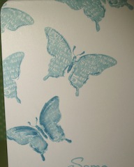
So now you know, I love balance and symmetry which is also why I had to add the scrunched up purple tissue paper. It helped lift the lavender  plus evoke the "designer stuff wrapped in tissue paper" feeling. I used the striped background for a wallpaper look. I inked around the card with black chalk ink but it was too CAS (ha!). So I added some stamping (I love Stampin Up Bliss - really adorable set). I'm happier with it now.

I knew what sentiment to put but did not have the stamp NOR the inclination to build it using alphabet stamps (what, add another hour?).  I scoured the web for fonts that I thought would go well and in the end settled for the typewriter. I've never actually done this journalling style before.

There had to be a mounted mirror somehow. This was built using nesties and the mirror sandwiched between (yes, it's 3D and safe). And bling, too, of course - I love Stampin Up rhinestones.

Frankly, I'm so GLAD it's done (it's over, yay). I really can't bear to do any more experimentation on one card; it was getting ridiculously all-consuming.

Well, I hope it was worth your while visiting me this time. I hope you picked up something new and inspiring. For the record, here are the new things I tried with this challenge:
  1. the colour combination itself - orange, red, lavender  (will probably never use it again)
  2. Stampin Up Heat and set powder (with Dazzling Diamonds)
  3. Twinkling H20s over the dazzling diamonds
  4. cut-up journalling (might do this again)
  5. digital sentiment (might do this again)
  6. scrunched up tissue paper
  7. sandwiched mirror (could do a scrapbooking embellishment)
7, that's a nice number to end with. The list of things I did that got scrapped is much longer than 7 - you don't really want to know about them.

Cheerio. Thanks for stopping by. And if you're one of those who spend a lot of time on your craft, please leave a comment to help me feel normal again.

Monday 14 March 2011

OLC week 6 - Off the edge


Week 6 Challenge over at Simply Less is More is "Off the edge".  My first thought was to use SU's medallion stamp - it just lends itself to this.

BUT... with these inspiration cards from the talented duo at SLiM, I changed my mind.

I was tempted to use the dress stamp from Inkadinkadoo but I've done that for a challenge before, not OLC, but a challenge anyway..

Here are what I came up instead. I still had the dress thing going but I "made" it myself. :-)

stamps: SU Bliss, Just Believe
inks: SU Baja Breeze, Marina Mist (marker)
bling: Dazzling Diamonds

I thought the sentiment was so appropriate - I had to believe there is a dress in the Bliss set and so there was ( a couple even)!

I started with this (left).  I only used the bottom half of the butterfly. I thought the angle of the  dress was a bit "severe". That is, I intended to have the dress a little bit more upright.  So, I started on another card (right). For a bit of a change, I decided to use the whole butterfly stamp. Position of the sentiment is relatively the same for both cards. I stamped the half-butterfly on the 2nd card first. With the more symmetrical 1st card, I thought I had to do a whole butterfly. Then, I decided to stamp a few more...off the edge as well.
While the 1st one was initially a "mistake", I think I like it more. My daughter can't choose between the two and is asking me to show her how I did it (not hard really, with the help of post-it note masks and a stamp-a-ma-jig)...and perhaps some imagination...
some things have to be believed to be seen.

Here are a few more photos of the details.


Enjoy!

Feel free to copy and improve. :-)

update:
Jo asked about the stamp-a-ma-jig. It's a stamp positioner. Mine is from Stampin Up. There are other brands out there. I've seen one made out of Lego bricks even. I like my SU one so happily recommend it.

Lots of tutorials out there on how to use it. Here's a link to a  really quick one.

Thursday 10 March 2011

OLW 44 - Marta's Pinterest

OLW Challenge #44 is all about finding inspiration from Marta's boards via a blogger named Marta, who also has an awesome blog: MartaWrites.com.


There's plenty of inspiration there, for sure. I made one quickly and, personally, I don't think it's good enough for a challenge entry but a challenge it was. See, here's my inspiration - lovely "chandeliers" made of scallops of paper layered on a sphere.


I asked myself if it was at all possible to replicate the effect on a 1-layer card. I also wanted to use more of my Stampin Up stuff. A challenge with layers, now who could resist that? :-)


Here's what I've done. I could probably do it better but decided if I was to do another one, I might as well choose another bit of inspiration from Marta's boards - there are so many after all.
stamps: SU A to Z, Teeny Tiny Sentiments
inks: SU Basic Grey, Soft Blue (marker), Cherry Cobbler (marker), DI Antique Linen


The "how" bit...


I created a circular mask using a nestie and post-it. I also created another mask using the SU slit punch and folded it over to create a scallop. Each scallop was stamped separately so the lines are all at different angles. I shaded the "shadows" with the blue marker and sponged the whole circle with the DI for added definition. Finally, I drew on the string and stamped "thinking of you" on 2 lines.


Ta da. It's CAS. It's OLC.


This isn't a good photo - night-time here and even with a flash, it's just not looking right. However, I couldn't wait to share. Tragic, huh?


Thanks for visiting and double-thanks for leaving a comment. You know I love them, right?


cheers,
Malyn

Tuesday 8 March 2011

PDCC71 - Color Splash x2

I already submitted this wall hanging for PDCC71 - Color Splash challenge. By the way, I'm happy to report that my daughter absolutely loved it and is now proudly up on her feature wall.

BUT, I really wanted to use some twine so I thought I'd enter again. I only have one colour and WISH that I have more. Just look at the colours available from The Twinery - they're all absolutely gorgeous.

I {heart} twine.


Here's my 2nd entry: black and white with a splash of red - the only colour of twine I have.

stamps: Stampers Anonymous - Good Thoughts, Stampin Up - Short and Sweet, polka dot background
inks: SU black, Craft white, Poppy Parade, Cherry Cobbler
twine: Kikki K

The Stampers Anonymous sentiment has a western feel to it so I thought I'd do a hint of corset - busting of course,  :-) , and tied with twine. The heart is a blend of the two reds (not so obvious on the photo), mounted up with dimensionals, and covered with Glossy Accents.

Now all I have to do is WISH BIG that I somehow win the twine sets (C'mon, make my day). Ha! Frankly, with all the fantastic entries, I probably should just keep wishing. :-)

Saturday 5 March 2011

PDCC71 - Color Splash

I'm quite enjoying The Play Date Cafe Challenges and #71 is no exception. It's black and white with a splash of colour of my choice (left).

The PDCC attracts some really talented people and the submissions - as well as the DT work, of course - are full of inspiration.

Last week's winner (right), by Neil Walker, particularly challenged and inspired me. This guy (yup, guy) is simply amazing.  I'm glad and certainly not surprised that he won.

My entry this week is inspired by Neil's wall-hanging. I thought I'd make one for my daughter who just started singing lessons. Frankly, I'm keen to keep this for myself and hang on my bedroom wall but maybe I'll just make another one instead.

The colour splash is my daughter's current favourite colour; it's the colour of her bedroom's feature wall.

 cardstock: SU black, white, cardboard
stamps: Kaisercraft music background
inks: Versafine Black, Tim Holtz Tumbled Glass distress ink
others: TH Alterations die - bird, glass beads, pearls, beading stuff

Die-cut cardboard was sandwiched between black (cage) and stamped white die-cuts (bird). Edges of the bird were distressed for better definition, and finally varnished for extra durability.

The TH colour - Tumbled Glass - actually inspired the choice of beads in terms of colour and materials (aqua blue and glass). I haven't done beading for a while so it was rather tricky to do but got there in the end.

This should be alright as a wall hanging or hanging off the ceiling as my daughter is more likely to do. Both sides of the bird have been stamped so should look alright from the back; it would look caged though and I prefer it out rather than in.

OLW 43 - Shimmer

Susan is hosting OLW 43 with the challenge of creating an OLC with shimmer - no glitter or bling. I opted for Twinkling H2Os, having just dug them out for my PDCC70 entry last week.

This time, I'm using various shades of pink and green. I decided to create two at a time - a crafter friend said it's a time-efficient way of doing it. True enough and also, you've got one at the ready should you make mistakes. :-)

Here are the two, slightly different. I embossed the card (Cuttlebug) and painted on with Twinkling H2Os. The embossing already has a water-colour effect to it. As such, my colouring is also watercolour-y - almost wet on wet. I even painted on a shimmery 'ribbon'...just for fun.

colours used: Chiffon pink, Blushing rose, Lemongrass, Irish mist, Solar gold

I positioned the 'ribbon' for this one slightly higher than the other and chopped off the rest of the card. It just didn't look balanced with so much white space at the bottom.

I considered painting the background a bit of blue but, obviously, decided not to. Doing OLC challenges is making me appreciate the beauty of untouched and deliberate white space.

I've added a couple of close-ups in the hope of showing the shimmer. Shimmer really doesn't photograph well, especially on a grey day like today. Actually, the shimmery colours here are helping brighten my day.

Anyway, which one is better of the 2: cropped or not cropped.


Wednesday 2 March 2011

OLW 42 - I've got the music in me

Jennifer set this music-themed challenge for a one-layer card (OLC) and I just couldn't resist doing it...even though I'm running out of time!

This bird with notes was my first idea. Notes are SU roller stamp, rolled over the card with a circle mask. Then I created a black rim around it with the idea of stamping the bird over a smaller circle mask. I tried this a couple of times and failed! In the end, I stamped the bird separately and mounted over the circle. Not an OLC but too good to throw away, IMO.

I changed tack completely and went for different stamps and sentiment altogether. The theme of laughter as music is very different from all the other entries so far. I thought, why not? Get it out there. :-)

stamps:
G-clef (very old Inkadinkadoo rubber stamp), Laugther (Clear Dollar Stamps), Laugh often (?). Actually the laugh often was stamped separately as the stamp itself reads "Live well, laugh often, love much" but, given the theme, I trimmed the others off

inks:
Versafine Black and red, Stampin up Basic black marker

I think this design and colours are reminiscent of Broadway posters. Don't you think?


I liked the mix of stamps so much that I made a couple more and played a little with the design.  OLC can be so challenging!!!! Anyway, here's another one with often on the other side. I actually think it makes the G-clef look like an S so you read it as Laugh Soften or Laughs often. Though I like this more visually, I don't like the effect on reading the sentiment.

Which do you like better?

Tuesday 1 March 2011

PDCC #70 - Yummy colours

When I saw this Play Date Cafe Challenge (#70), I knew exactly which stamp to use and what to colour it in with.

I've had the Stamp-It gecko stamp for ages. It's spots inspired all the dots, circles and spots used on the card. I also wanted to use my Twinkling H2Os which have been lying in wait for far too long.

Actually, I coloured it in with Tim Holtz distressing inks sprayed with Perfect Pearls mist, but wasn't happy so went back to the original plan. I think the Twinkling H2Os are just perfect in intensity and shimmer. I still used the distressing inks for the foreground frame, background AND, AND, AND the ribbon. I used the entire 'dyed' length as the colours are just soooo fun - unfortunately, organza is too thin to really show off the colours. Ahh well.

Here's the card.


I have to admit, cutting around the gecko was rather tricky. I'm not really good at cutting out so I tend to avoid it. But then, I wanted to make the gecko pop, literally out of the window, so cut I did.

Inks: TH Broken Sky, Spiced Marmalade, Shabby Shutters, Versafine Black

H2Os: Mediterranean blue, Lemongrass, Dreamsicle (orange)

Background stamp from Stampin Up (retired). Embossing folder from Cuttlebug. I also put some Glossy Accents on the eyes.

Not the best photo but it does show the shimmer a bit better. Look at those doleful eyes. If only geckos are this cute in real life. :-)